

Reading two teams against each other used to mean opening one view, memorizing the numbers, then opening another and doing the math in your head. Compare puts them on the same screen.
Turn on Compare on the Metrics page and it splits into two columns, A and B, each with its own scope and its own date range. Point them wherever you want:
- Team against team
- One person against another
- The same team across two different windows
It works on every tab.
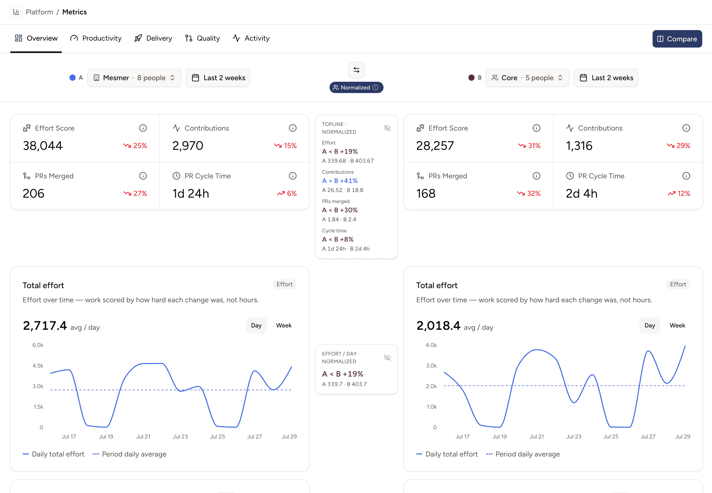
Are the two time windows different? Or is one team larger than the other? Don't worry — just enable the Normalized toggle and all data appears normalized to one person per day, so you're always comparing apples to apples.